As a UX Engineer, and later a Senior Product Designer, I lead the product redesign for "SaaSly".
SaaSly is a SaaS management application designed to help large organizations efficiently manage their software estate.
This portfolio piece showcases the comprehensive product design lifecycle, detailing how we revamped the outdated UI, conducted user testing, and enhanced the user experience to drive better outcomes.
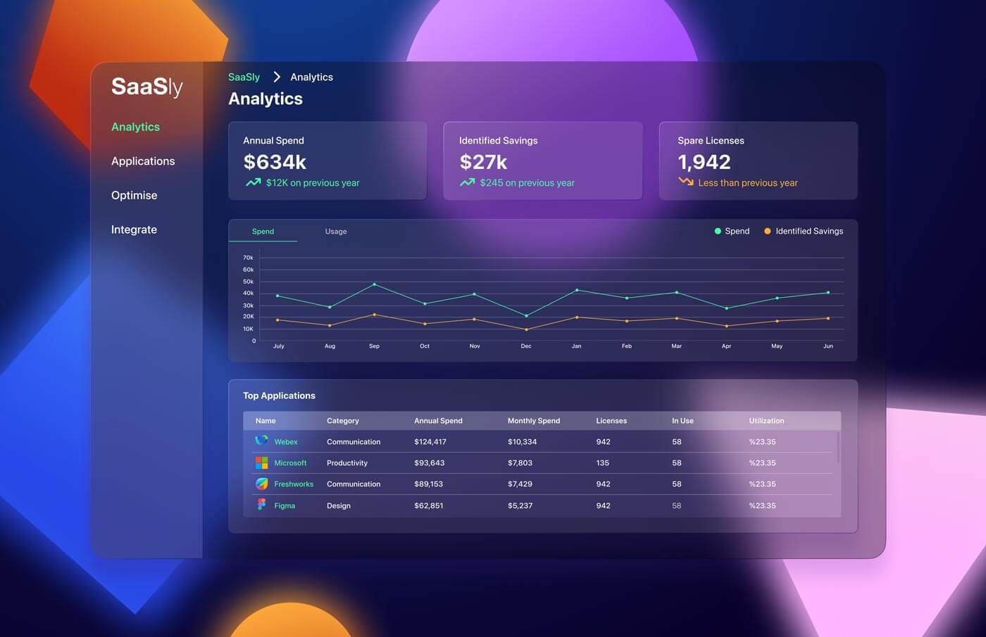
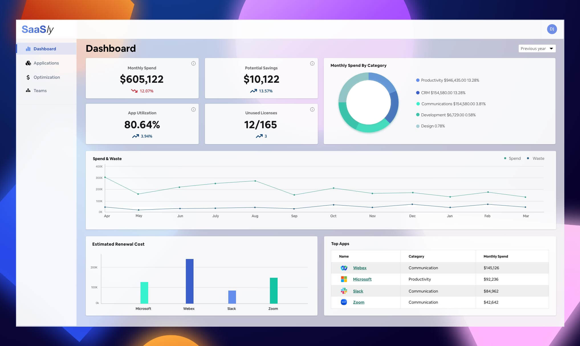
The Old UI...
Identifying the Challenges
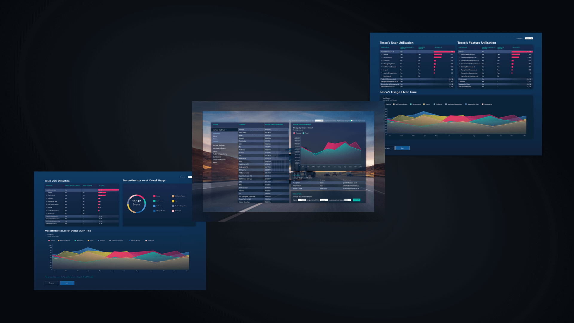
The MVP build of SaaSly was carried out by an external development agency, that had worked with the UX team to design an application which analysed SaaS data that the user could upload through an Excel template file.
Our in-house engineering team had built API connectors for Zoom and Microsoft, but the UI was already misaligned with the rest of our organisation’s products, as the external agency had deviated from our component library to build the application due to time and financial constraints.
People For Research User Testing
To better understand what usability problems and opportunities to prioritise for development and design, we gave our personas to People For Research who helped us identify 12 users who had worked in the SaaS and TEM (Technology Expense Management) space. They consistent of mainly IT managers responsible for software estate management.
We wrote interview tasks to be carried out by 12 users, these were primarily just talking points to aid the conversation and to get the user’s thoughts on the information architecture and placement of functionality within the application.
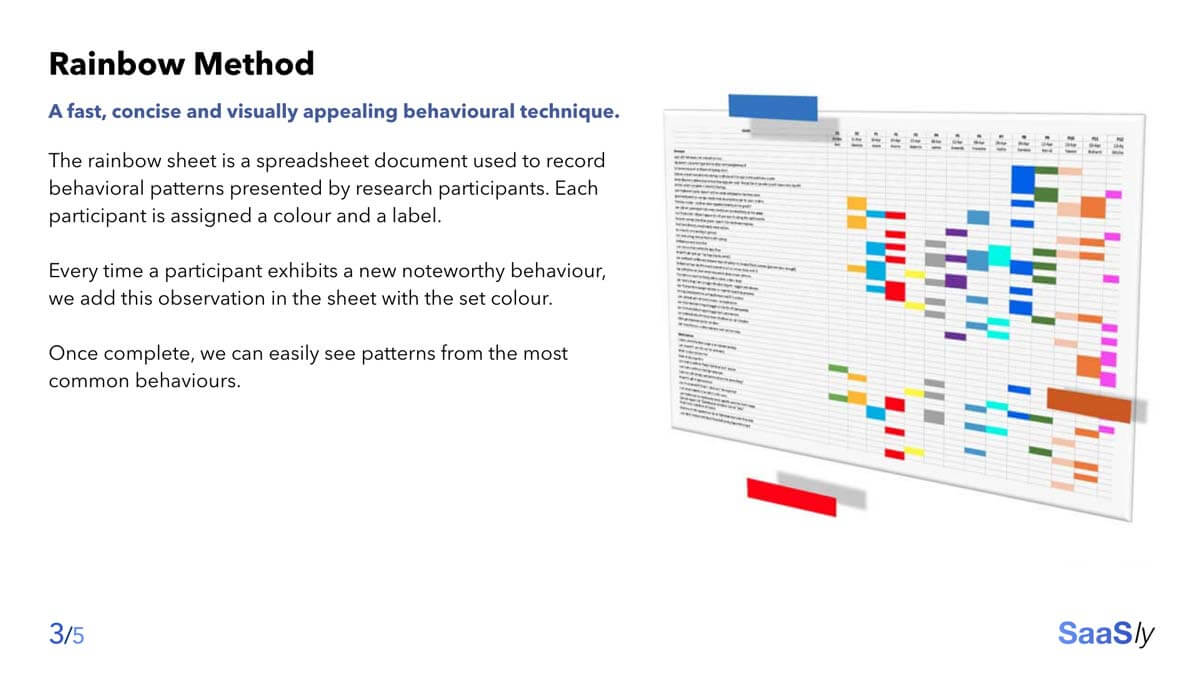
As we received the feedback we created a rainbow analysis of the different pain points, mismatched mental models, and opportunities to show any correlation around the feedback given.
We then created an affinity diagram of the different feedback categories, from taxonomy , Icons, User Priorities, Suggestions, and bugs/snags which was important to present feedback to stakeholders.
Using the rainbow analysis, we were able to use percentages to communicate the importance of usability issues and missed opportunities to stakeholders. This was important for prioritising what features/bugs Engineering were going to focus on in the coming months.
UI Improvements
As a UX Engineer, I worked with the development team for a year to improve the UI using these research findings. I also reviewed the font-sizes and font choices. The application originally used Cereal – a font family used by Marketing, completely inappropriate for a web app. I updated the application to use Helvetica Neue and to use the semantic Material UI typography component.
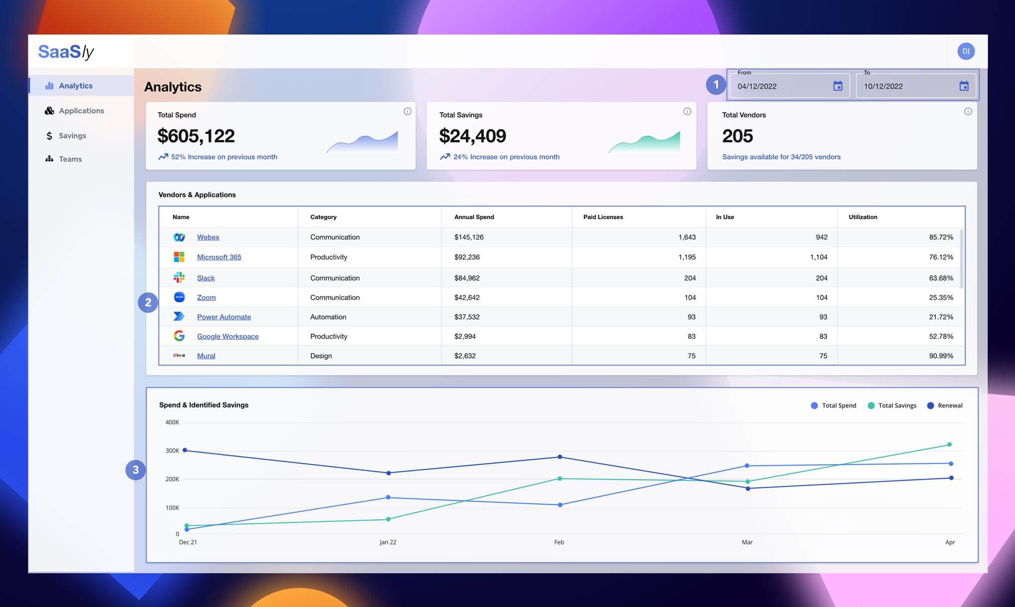
42% of the users said that they would require a date picker on the overview page (1) so this became a priority to implement for the development team.
We also found from tracking data in Heap that users primarily used the Applications table to navigate to the Application Details page and weren’t using the bottom half of the original Overview page. We bought the Applications table into the Overview page (2) and deprioritised the line graph (3).