arrow_back

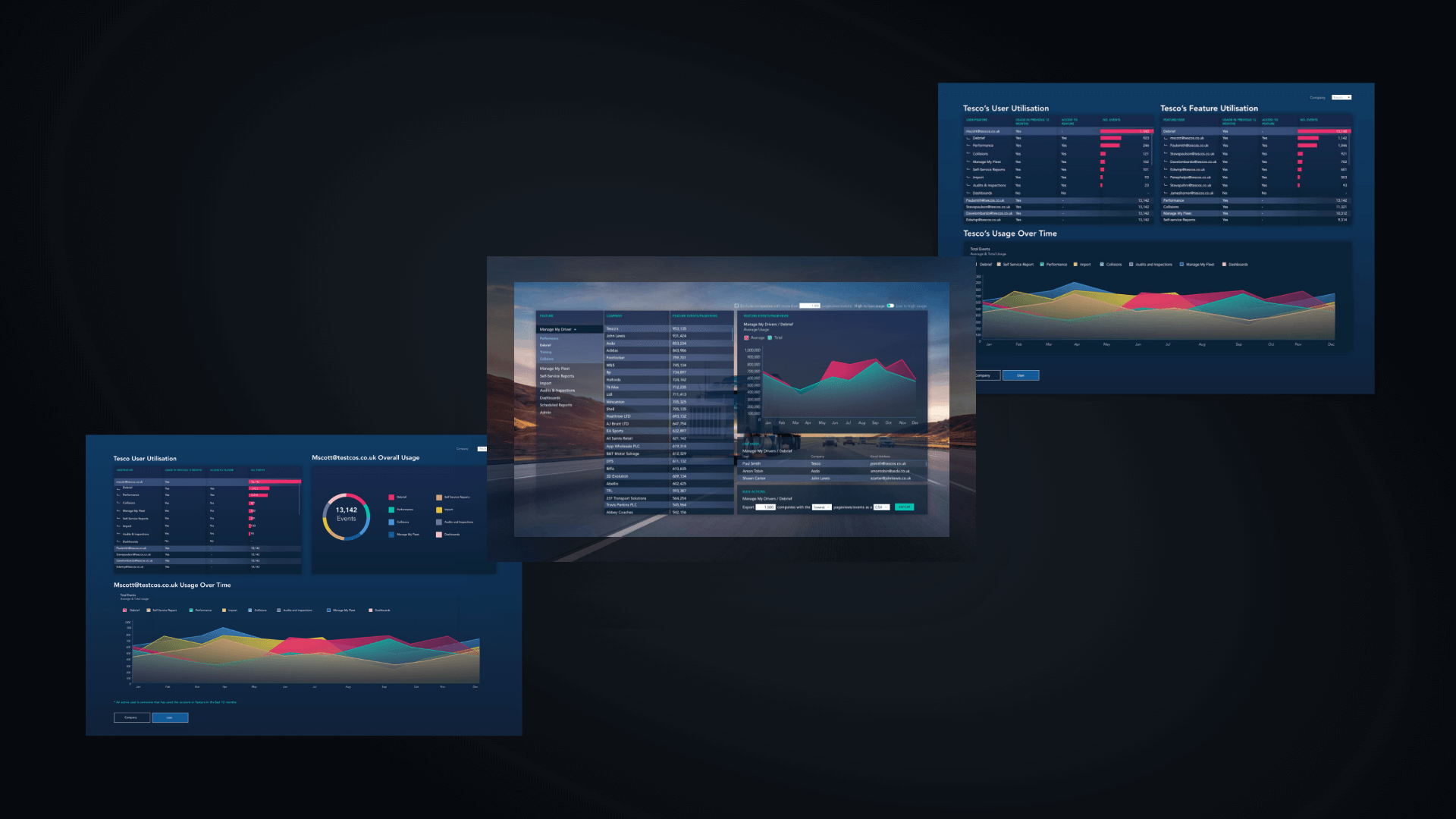
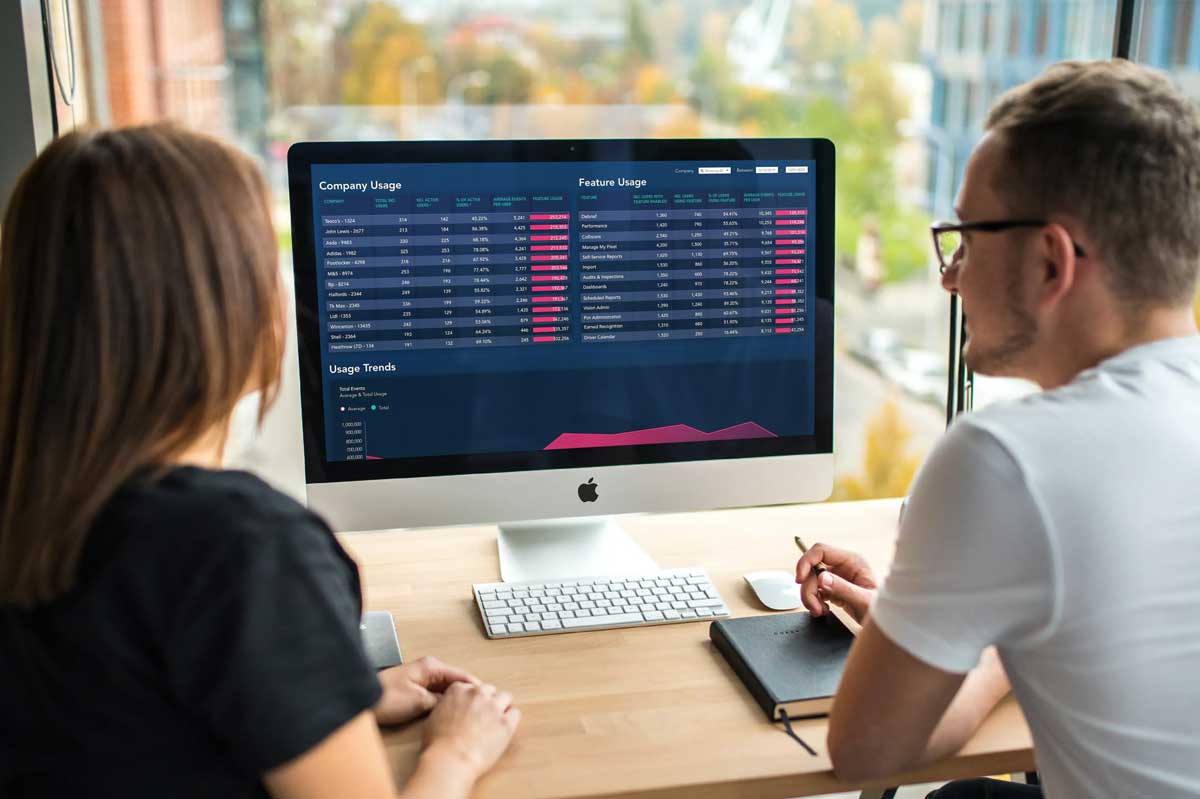
Data Visualisation for Logistics UK

To better market our logistics and compliance platform to its 36,000 monthly active users, how might we present data in a way which enables the marketing team and our contract managers to get insights into which features get used and by which of our 4,000 accounts.

Role
  • User Experience & User Interface Designer
Project
  • Data Visualisation for the Logistics Industry

We initially started by having multiple discovery sessions to scope out requirements and to get a clear picture of what Marketing needed and what their objectives from the dashboards were.

We found that one of the main problems with marketing an app as vast and as widely used as Vision, the compliance platform we build and maintain, was that (aside from Google Analytics which we do a lot of) we struggle to get insights into user behaviour on an account by account basis.

We were collecting account data and viewing it through our Angular JS web app but it was only really visible to some of our full-stack team.

Being able to see how different accounts use our web app is important for me as a UX designer but also really valuable for our marketing department, making it possible for them to target accounts with relevant marketing content.

I started by sketching out very rough drawings as a quick way of validating ideas. I then worked closely with our senior database and BI developer to navigate what would be possible using Power BI. 

Having designed multiple dashboards now for Vision, the hardest part (and what takes most of the time and energy during design reviews) is deciding on what terminology within titles, table headers and filters will best aid comprehension and perceivability for the user. 

Often with data visualisation at the design stage (at least on Dribbble) it looks nice, and order, formatting and visual hierarchy is important when displaying complex data sets, but it can be hard to know what the data means. I try to keep this as a lighthouse to avoid when designing dashboards now as its functionality and its utility within the company is what its success or failure will be based upon. Especially within a large organisation like Logistics UK and a dev team spending 2-4 sprints implementing the solution.

After many iterations and design reviews, we decided on a solution which incorporated a 3-page dashboard. It gave the user the ability to view account utilisation and showed page views and average session durations broken down by account.

There is also a graph to display how the app was being used over time. Within the table, by clicking or tapping into Tesco for example (or by using the filter), this would show which features Tesco were using within the app and which, if any, they might benefit from hearing more about, either through marketing or from our contract managers.

Summary

After the design stage was finished I stayed hands-on to provide any UI materials and to give feedback on the frontend.

Power BI is somewhat limited in terms of its UI capabilities. Annoying issues like not being able to use the same font that we use across our app meant having to compromise the UI and to make design decisions on the fly.

However, contract managers and Marketing are regularly using it to keep updated with which customers are utilising which areas of our app. It raises awareness of app utilisation across the organisation for stakeholders and for the development team which, in turn, steers our design and development decisions and how we best spend our time and resources to bring value to our users.