Poor UX is the default for many local government websites and Tunbridge Wells Borough Council was no exception.
Non-responsive and needlessly complex user journeys create frustrating experiences for users who essentially have no other option but to use local government websites. Can a fully responsive, clean and minimal look improve customer satisfaction, improve accessibility and increase the uptake of our site on mobile and tablet?
Tools: Google Analytics, Sketch, inVision, Photoshop, Squiz Matrix.
Languages & Frameworks: HTML, CSS, Javascript & Bootstrap.
Research
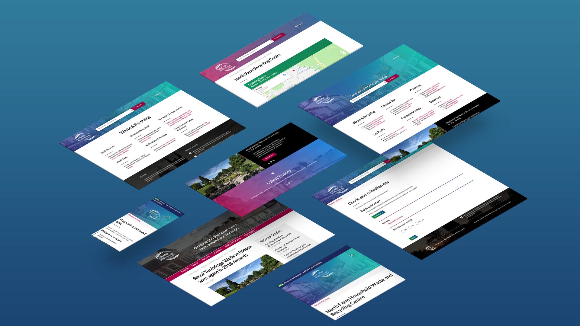
The first stage in the redesign was to identify the most common use cases across the site. To do this we utilised GA to get quantitive insights to guide the design of the home page. These insights into what users came to the site to do steered the visual hierarchy and prioritisation of screen real estate on the homepage.
We broke the content down into six sections; Waste and Recycling, Council Tax, Planning, Parking, Elections and News and Events. This was based on our Google Analytics research findings that over 80% of our users came to the site to do a task related to these six categories.
We then conducted usability tests to get qualitative insights into the context, goals and behaviours of users for the main use cases on the old site. One of the key finding from our research (which we could have hypothesised) was that nobody wanted to be on a local government website any longer than they had to be. This presented the challenge of changing the way an organisation (and its many moving parts) views itself from the inside out and facilitated a better conversation when deciding on which pages and service areas to prioritise on the homepage.
Service Design
Alongside the site design and development we also had the challenge of promoting channel shift towards digitisation and automating internal services to run digitally. We held multiple sessions for planning out process flows and ideal user journeys. Using a platform, we then built the end to end process which was usually triggered by a form submission from a user on the website.
Wireframes & Card Sorting
With these insights gained, the next step was to begin to create low fidelity wireframes to show to stakeholders the bones of the concepts for the 15 main page layouts. Being able to visualise the concepts in grey scale facilitated conversations around flow and site structure before the design system came into play.
We used Treejack from Optimal Workshop to do closed card sorting which we ran through our old website. It gave us the data which would end up steering the information architecture on our site.
Medium Fidelity Prototypes
I chose Lato as the main font to use in the design system for the mock ups as it’s san serif and minimal style makes it easily scannable and easy on the eye when viewing over long periods of time. The 2/3 layout of the desktop screen was also chosen to assist with scan-ability and to aid comprehension.
Front End Development
After the designs had been agreed by the digital team and internal stakeholders I worked closely with a developer to get the designs from mockup into code. We used Bootstrap as our main framework for this which sped up the responsive side of the development. We then put the code into Squiz Matrix (our CMS).
Summary
The final website got launched 2 years after I left, however, there were a lot of lessons to be learned about users and how they interact with a civic site.
Ultimately, when it comes to a government service the key principles I tried to stick to were to keep processes lean and to try internally to promote common sense when mapping out user flows.
Something as democratic as a local government website (in its function and in the way it gets constructed) leaves a lot of opportunity for stakeholders to compromise the quality of the design. Learning how to navigate the conversations to eventually end up with something that works for the users and keeps stakeholders invested was a really important skill here.