


Fly UX Mobile App
This was a hypothetical project carried out to gain a Professional Diploma in User Experience Design through Glasgow Caledonian University.
Project
-
Professional Diploma In User Experience Design
Role
-
User Experience Designer
-
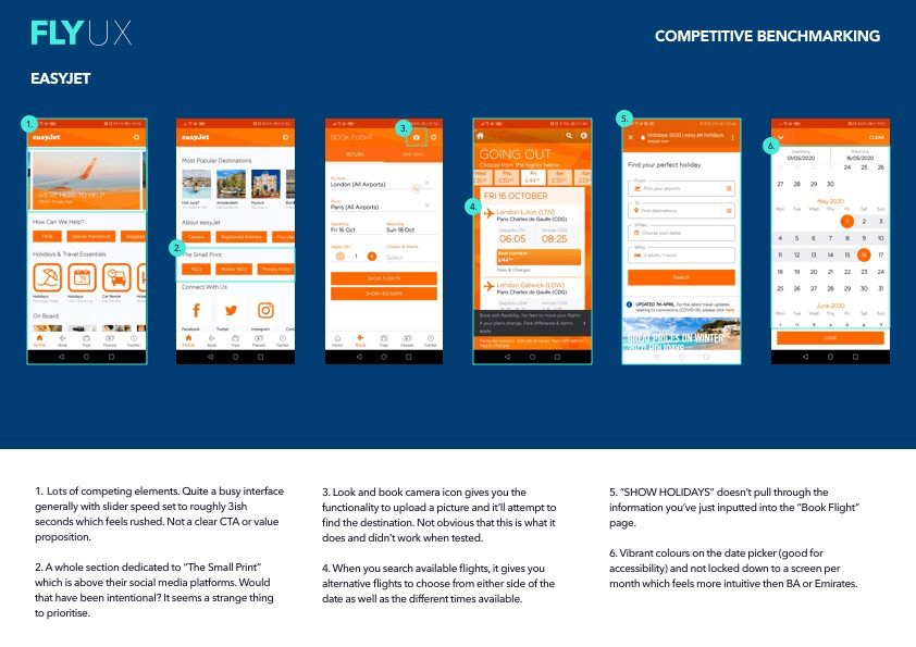
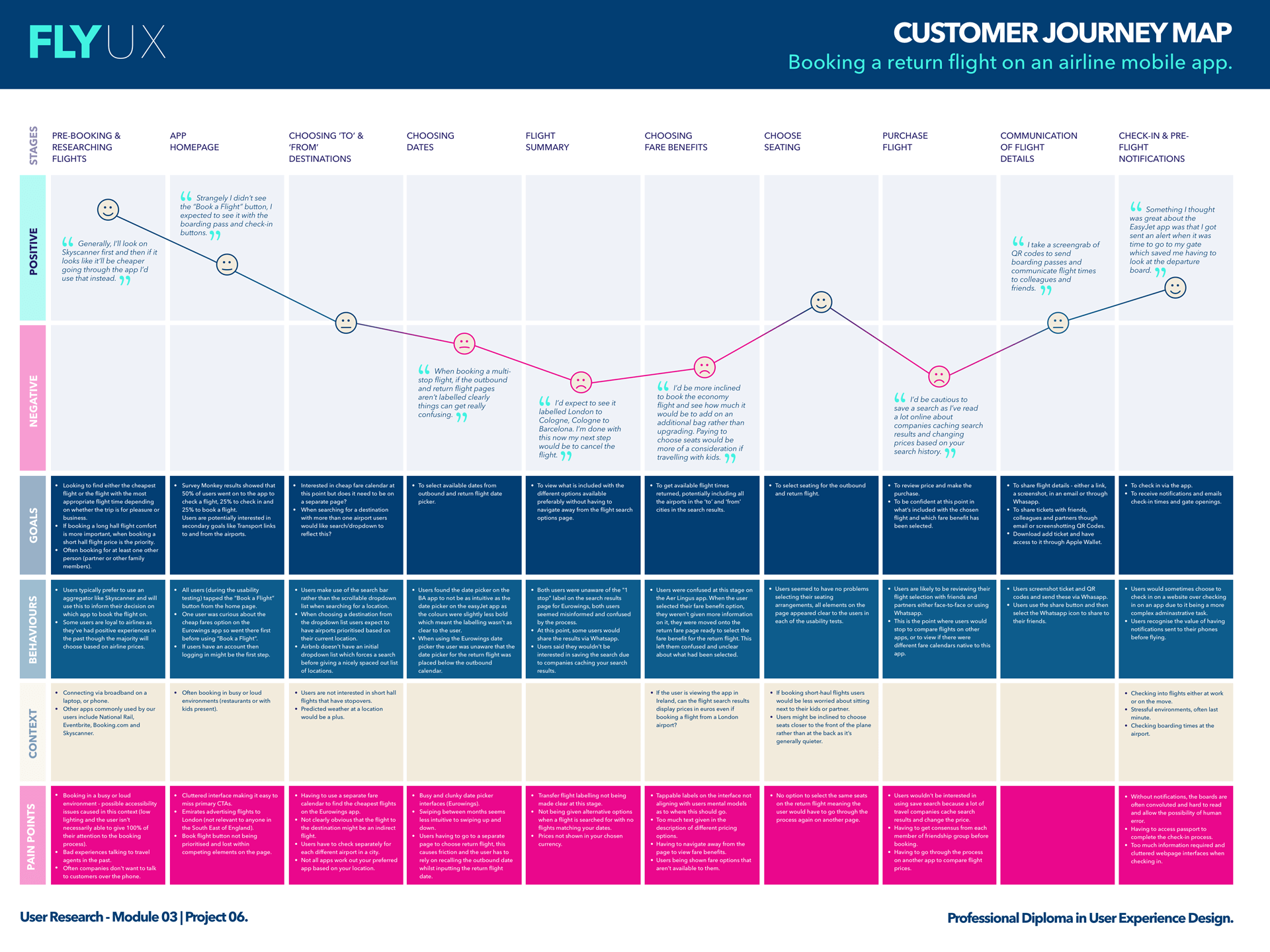
Competitive Benchmarking
Competitive benchmarking involved looking closely at how competitors solve similar UX problems. It also helped to identify any conventions and design patterns I felt worked well (Airbnb) and things to avoid (specifically the android version of the easyJet app).
-
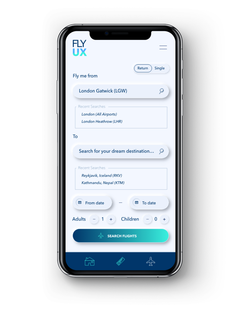
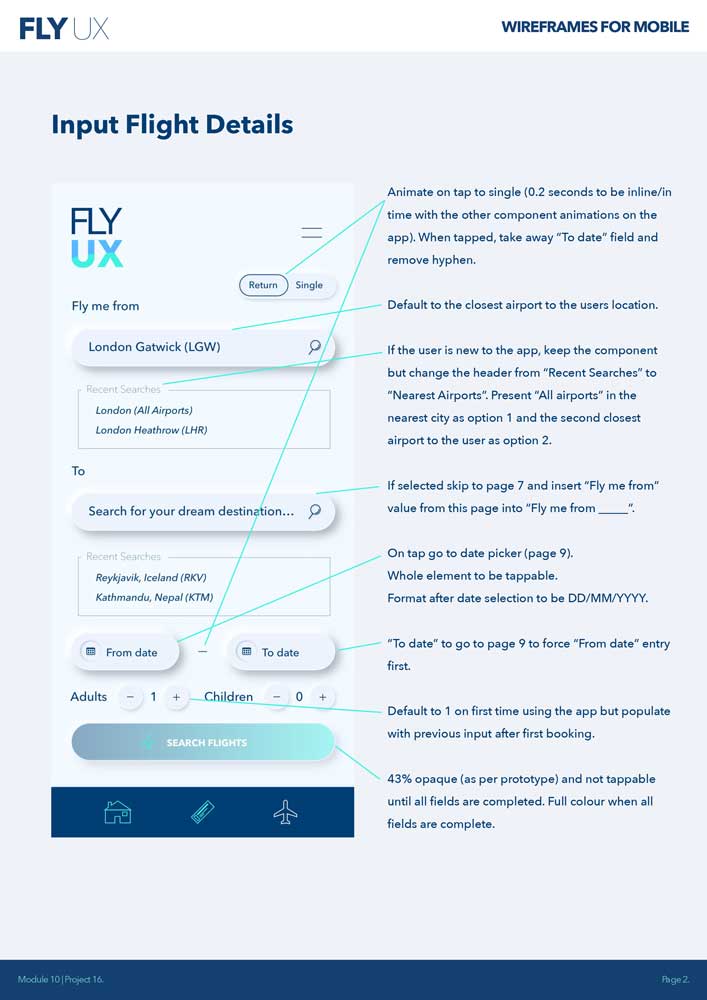
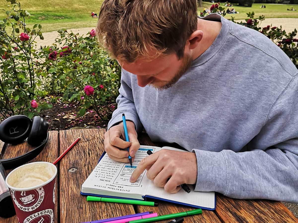
Interaction Design
I designed each interaction based on what was defined in the mobile flow diagram. To do this I sketched using pen (uniPin 0.5, the best pen there is) and paper. This took the emphasis away from fonts, colour schemes and any design software technicalities, and enabled me to focus primarily on ensuring that each interaction within the flow had been considered and none of it would be left to chance.